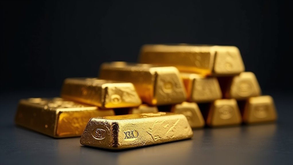
Charts tracking gold and silver’s historical dance reveal a wild financial soap opera. The ancient 15:1 ratio has exploded to 85:1 today, thanks to market manipulation and panic-driven swings. Remember the Hunt brothers’ failed attempt to corner silver in the 70s? Pure greed. With gold at $2,387 and silver at $28 in 2024, something’s gotta give. These precious metals tell a fascinating tale of human nature – and there’s more beneath the surface.

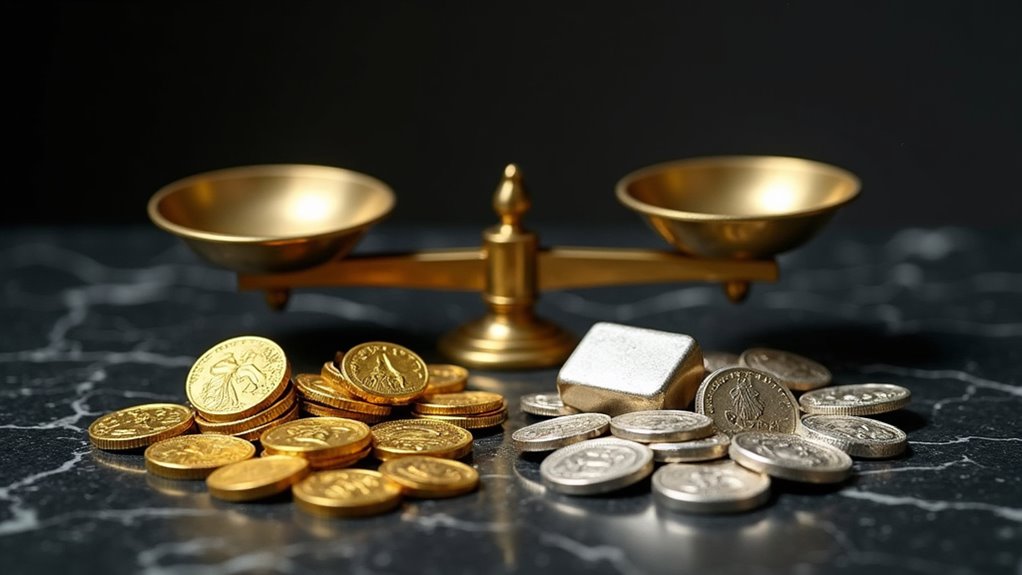
The meteoric dance between gold and silver prices has captivated traders and economists since ancient times, revealing an intimate relationship that’s anything but stable. Throughout history, their price ratio has told a wild tale – from the ancient 15:1 relationship that held steady for centuries to today’s mind-boggling 85:1 spread. Let that sink in: you now need 85 ounces of silver to match just one ounce of gold. Something’s definitely out of whack.
Charts don’t lie, and they’re showing us something fascinating. While gold’s been playing it cool like the popular kid at school, silver’s been bouncing around like a caffeinated squirrel. Just look at April 2020, when the ratio hit a ridiculous 125:1 – a historical anomaly that made veteran traders’ heads spin. And yet here we are in 2024, with gold strutting around at $2,387 per ounce while silver lurks in the shadows at a mere $28. The Hunt brothers’ attempt to corner the silver market in the 1970s shows just how volatile these prices can get.
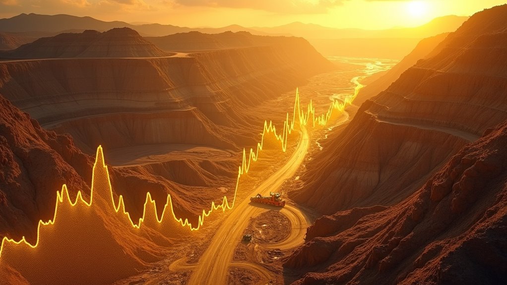
Anyone who’s spent five minutes studying precious metals charts knows they’re not just pretty lines on a screen. Their vertical axes scream dollar values while horizontal timelines stretch back decades, telling stories of economic panic, industrial revolutions, and plain old human greed. These aren’t just numbers – they’re fear and euphoria quantified. The government once maintained a fixed rate of $20.67 per ounce for gold during the early American republic. Investors often look to historical data to make informed decisions regarding their portfolios.

The tools traders use to decode these charts would make a rocket scientist jealous. Moving averages, RSI, Bollinger Bands – it’s like a technical analysis fever dream. But here’s the kicker: even with all these fancy indicators, nobody saw silver exploding to $50 an ounce in January 1980. Shows what the experts know, right?
Let’s get real about what drives these metals. Sure, economic uncertainty plays its part, but so does plain old supply and demand. Silver’s got a split personality – one foot in the safe-haven camp, the other in industrial applications. Meanwhile, gold sits pretty on its throne, maintaining its reputation as the ultimate panic button for investors who think the sky is falling.
The data tells us the long-term average ratio since the 1970s hovers around 65:1, but that’s like saying the average person has 1.99 legs. The real story lies in the wild swings, the unpredictable spikes, and the gut-wrenching drops that keep traders up at night. Modern charts, with their real-time updates and interactive features, give us front-row seats to this ongoing drama.
Here’s the bottom line: these charts aren’t just tools – their historical record of humanity’s longest-running financial relationship. They’re showing us something’s seriously off with the current ratio, but whether that means silver’s undervalued or gold’s overpriced is anybody’s guess. One thing’s certain – the next chapter in this story won’t be boring.
Frequently Asked Questions
How Do Global Political Tensions Affect Gold and Silver Prices?
Global tensions send precious metals soaring – it’s like clockwork.

When wars break out or political drama hits, investors run straight to gold n’ silver as their safety blanket.
Just look at 2024-25: conflicts in Eastern Europe and the Middle East pushed gold to a crazy $3,057.
Central banks, especially in shaky regions, start hoarding the shiny stuff like there’s no tomorrow.
Let’s face it – chaos equals higher prices, period.
What Role Do Central Bank Policies Play in Precious Metal Valuations?
Central banks wield massive influence over precious metal prices through their monetary policies.

When they slash rates or launch QE programs, gold and silver typically surge as investors flee weakening currencies.
Their own gold-buying habits pack a punch too – just look at China’s strategic purchases creating that $2,600 price floor.
Even their public statements can spark market frenzies.
Let’s face it – these financial puppet masters basically control the precious metals show.
Can Precious Metals Protect Against Hyperinflation in Modern Economies?
History doesn’t lie – precious metals have consistently proven their worth during hyperinflation.

Look at the 1970s when gold exploded from $35 to $850.
But here’s the kicker: it’s not a perfect shield. Sometimes metals lag behind inflation spikes, and modern economies are way more complex than before.
Still, gold and silver’s finite supply and independence from government money-printing makes them a solid hedge.
Just don’t expect them to save your bacon overnight.
How Do Mining Production Costs Impact Silver and Gold Market Prices?
Mining costs are the brutal reality check for precious metals.
When production hits $1,276 per gold ounce, it creates a price floor – miners ain’t working for free.
Silver’s cheaper to mine at $11-20 per ounce, but still needs decent margins.
These costs basicly force market prices higher over time.
Sure, daily trading swings happen, but try running a mine below production costs… good luck with that!
The math dont lie.
Why Do Gold and Silver Prices Sometimes Move in Opposite Directions?
While gold and silver are both precious metals, they dance to different beats.
Gold’s the classic panic button – when markets tank, investors rush to it like kids to an ice cream truck.
Meanwhile, silver’s got a split personality – half precious metal, half industrial workhorse.
When the economy’s humming, silver often rises on manufacturing demand while gold yawns.
Different forces drive each metal’s price, creating these opposing moves. Simple as that.